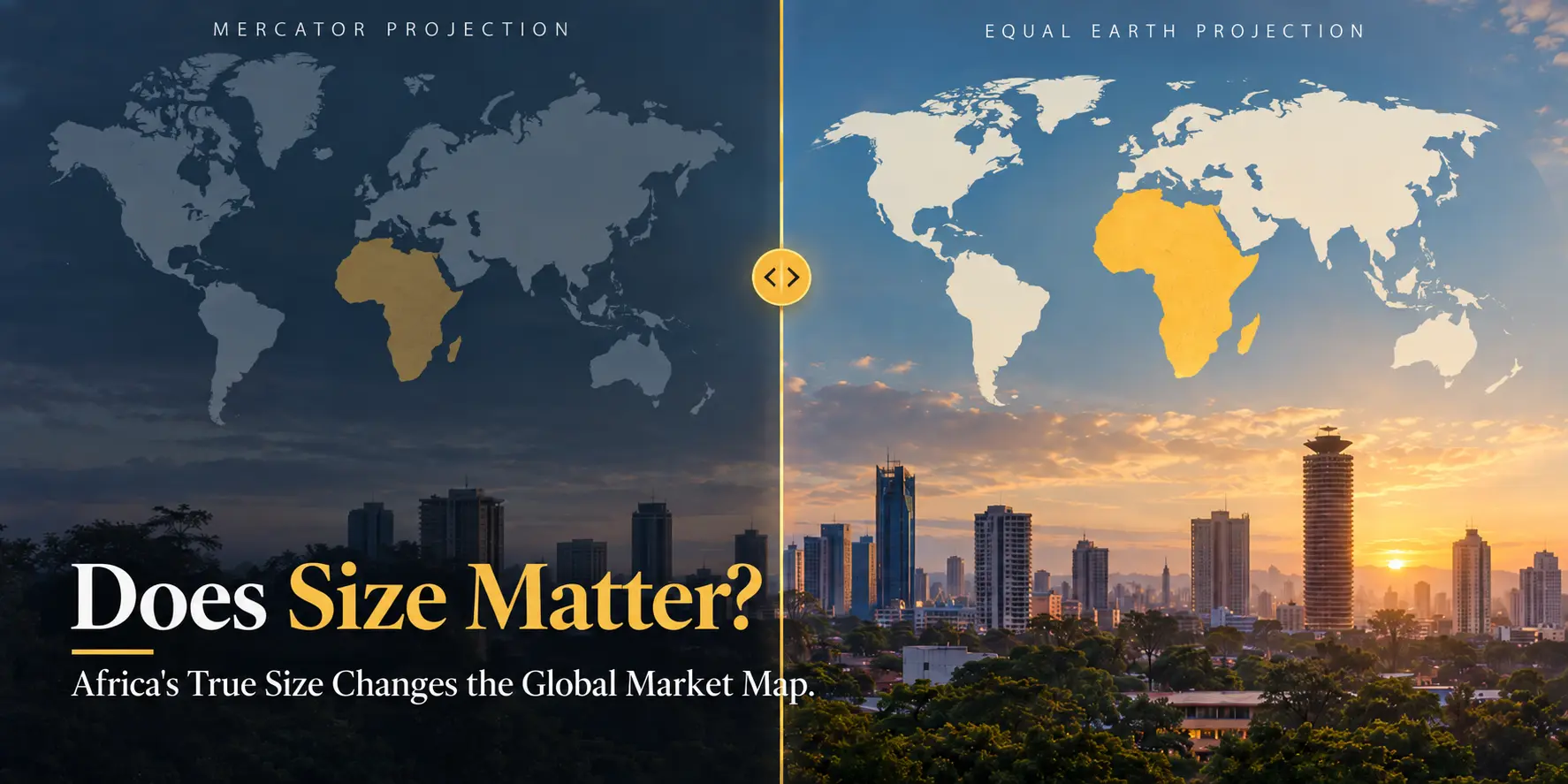
For generations, the world has looked at Africa through a map that makes the continent appear smaller than it really is.
That may sound like a geography-class curiosity. It is more consequential than that. Maps help form our mental picture of economic weight, distance, scale and opportunity. When the visual reference point is distorted, our intuition can be distorted with it.
On 4 September 2026, the United Nations General Assembly overwhelmingly backed a resolution encouraging a more accurate representation of the relative size of Africa and other parts of the world. For businesses looking at African markets, the timing is useful. Africa's physical scale is enormous, and the commercial effort to connect its economies through the African Continental Free Trade Area is becoming increasingly important.
Why Does Africa Look Smaller on Most World Maps?
The best-known culprit is the Mercator projection, developed by Flemish cartographer Gerardus Mercator in 1569.
A map projection is simply a method of taking a round planet and displaying it on a flat surface. That cannot be done perfectly. Every flat world map has to compromise on something: shape, area, distance or direction.
Mercator made a very useful trade-off for navigation. It preserves local angles and directions, which allowed sailors to plot straight compass courses across a chart. The price is distortion of area. The farther you move from the Equator, the more land is visually enlarged.
Greenland, Canada, northern Europe and Russia therefore appear much larger relative to equatorial regions than they really are. Africa is not literally being uniformly "shrunk" by Mercator. Instead, high-latitude regions are being enlarged far more aggressively. To the viewer, however, the result is unmistakable: Africa looks substantially smaller relative to much of the northern world.
Mercator vs Equal Earth
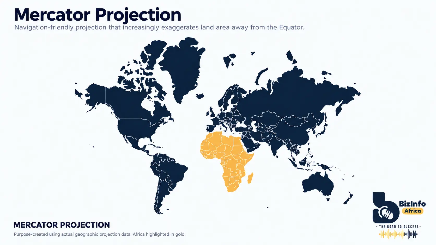
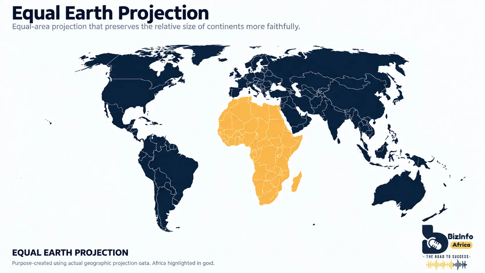
How big is Africa really?
Africa covers roughly 30.3 million square kilometres. Greenland covers about 2.2 million square kilometres. Yet on many familiar Mercator maps the two can appear surprisingly similar in scale.
In reality, Africa is approximately fourteen times larger than Greenland . It is also roughly three times the size of the United States. Put the United States, China and India together and they still occupy less territory than Africa.
What Did the UN Actually Decide?
On 4 September 2026, the UN General Assembly adopted the resolution "Correct the Map: Rebalancing Global Cartographic Representation and Promoting Equitable Representation of the World's Regions, Particularly Africa."
The proposal was introduced as draft resolution A/80/L.104, led by Togo on behalf of the African Group and supported by the African Union. It was approved by 164 votes in favour, one against and six abstentions . The adopted resolution is recorded as A/RES/80/307.
The resolution does not ban Mercator, nor would that make technical sense. Mercator remains useful for purposes such as navigation. Instead, the resolution encourages governments, schools, international organisations and technology companies to use projections that show relative area more accurately where size matters.
One prominent alternative is Equal Earth, introduced in 2018. It is an equal-area projection, meaning that land covering a particular share of the Earth's surface occupies the same proportional area on the map wherever it is located.
Source references: United Nations General Assembly resolution A/RES/80/307 and the UN Office of the Special Adviser on Africa.
Why Does Africa's True Size Matter for Business?
No sensible investment committee is going to approve a market entry because a continent looks larger on a wall map. But maps operate much earlier in the decision-making process. They help build the mental model through which we interpret distance, scale, commercial centres, supply chains and relative importance.
When the same visual representation is repeated in classrooms, presentations, news graphics, corporate reports and digital products for decades, those impressions become familiar enough to feel objective.
This becomes especially relevant when thinking about the African Continental Free Trade Area (AfCFTA) .
The AfCFTA brings together the countries of the African continent around the ambition of creating a more integrated market for goods and services. African Union figures commonly describe the potential market as more than 1.3 billion people with approximately US$3.4 trillion in combined GDP. More recent World Bank analysis describes the integration challenge as connecting 54 economies and approximately 1.5 billion people.
Those numbers provide a much better picture of African market opportunity than any map can. But put them beside an accurate representation of the continent's physical geography and the scale of the commercial challenge also becomes clearer.
Africa is vast. Moving goods from Mombasa to Lagos, connecting supply chains between Southern and East Africa, or building distribution networks across multiple regional economic communities involves substantial distances, border systems, transport corridors and infrastructure requirements.
That is one reason the AfCFTA matters. The opportunity is not simply tariff reduction. It is the gradual construction of a commercial environment in which regional value chains, transport links, digital networks, payments and standards make cross-border African trade easier.
Africa should be evaluated as a collection of diverse national and regional markets operating across an exceptionally large geographic space, with a major integration project attempting to make that space commercially more connected.
Has the UN Resolution Changed Maps Yet?
Not overnight.
The resolution is non-binding, and Mercator remains deeply embedded in modern mapping. Its digital relative, Web Mercator, is widely used by online mapping platforms because it works well for interactive maps, tiles, zooming and navigation.
That does not mean every digital map is visually misleading in the same way at every zoom level. It means the projection is technically useful for a different purpose from comparing the real-world area of continents.
The immediate significance of the UN vote is therefore less about replacing every map and more about changing the default choice where relative size is part of the message. Educational materials, media graphics, institutional publications and corporate presentations can use equal-area projections when they are trying to communicate geographic scale.
That matters because businesses also consume geography visually. Market reports use maps. Strategy decks use maps. Trade corridor analyses use maps. Investment presentations use maps. The projection chosen can subtly influence how the audience interprets scale before the underlying numbers even appear.
So, Does Size Matter?
When assessing a market, yes, but not by itself.
Land area does not automatically produce economic opportunity. Population, purchasing power, infrastructure, logistics, regulation, institutions, political risk, technology and access to finance all matter considerably more to a specific investment decision.
But scale is part of the picture, and Africa's scale has been visually understated in one of the world's most familiar ways of depicting geography.
Correcting that representation does not make Africa larger. It does not add a dollar to GDP or move a single container across a border. What it can do is give investors, entrepreneurs and business professionals a more accurate starting point for thinking about the continent.
And once the map changes, some familiar assumptions begin to look different too.
See Africa at its true scale
Explore the BizInfo Africa Intelligence Map and move from geographic scale to market intelligence. Examine Africa's proportions alongside economic indicators and reconsider what accurate representation means for how we understand African markets, trade and investment potential.
Explore the Africa Intelligence Map